Bartlandish
.jpg)
Graphic Design
◆August 2021
About
Graphic Design
◆August 2021
In August of 2021, the Instagram account @realbayareamemes posted a photo of a design someone had made that combined the iconic Oaklandish brand's logo with the BART map.
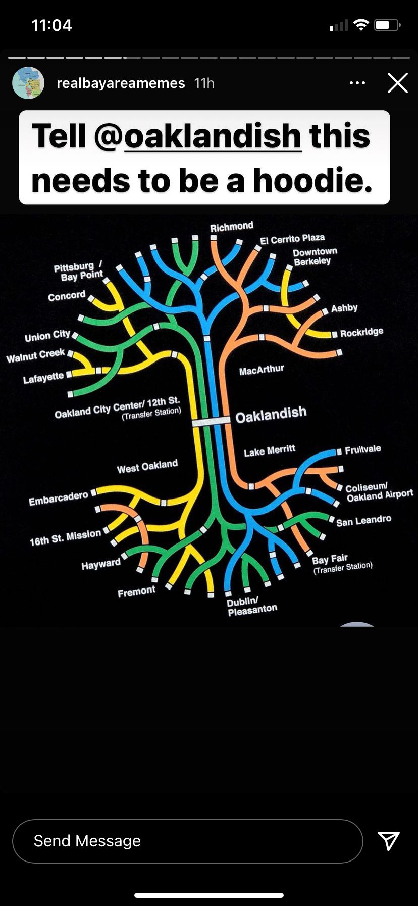
The problem? It didn't have all the stops. I, hitting my stride with Adobe Illustrator around that time, took it upon myself to make a better version.
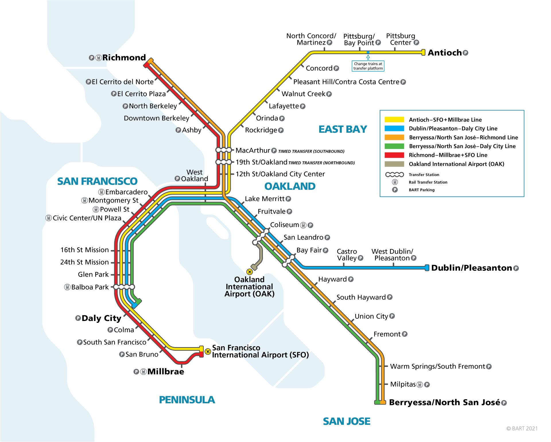
The design
I managed to make a design with almost every stop represented by an end of a branch/root on the logo, but there were a few I had to strategically place in other spots. My favorite detail that ties the whole thing together is that every stop in my design corresponds to a line that it actually runs on. The Richmond stop (orange on mine) is accessible by the red and orange lines, Fruitvale (green) is on orange and green, and Rockridge (yellow) really is only on the yellow line.
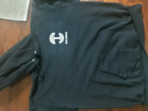
The hoodie
I only planned to make the design and move on, but someone reached out to me after the Real Bay Area Memes account reposted by design asking if he could make a hoodie for himself out of it. I gave him permission, and he texted me back a couple weeks later with pictures of the hoodie he had made. Excuse the low quality photos, I had to dig these up from an Instagram archive.
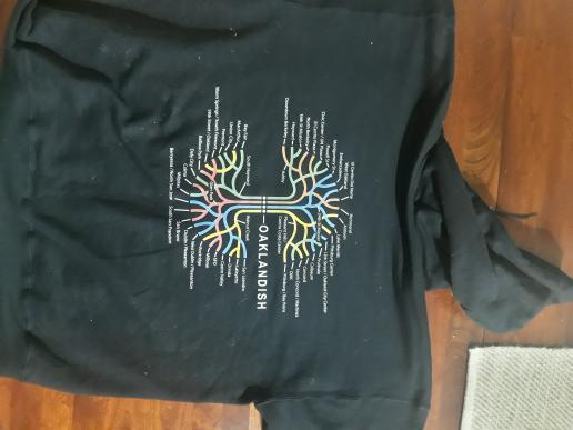
I've wanted to get my own version of the hoodie made ever since, but still haven't to this day. Maybe when the BART map is expanded and I have a reason to revisit this project, I'll make one for myself.